Opinion
An argument for typographic restraint: start with one good family, make a second font earn its place, and treat a third as a red flag for both design and performance.
Draft: full write-up coming.
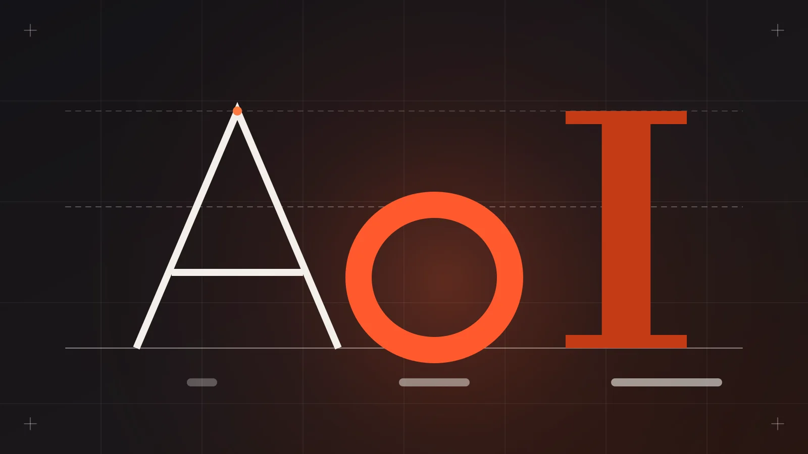
Every design review has that moment. Someone opens the type styles panel and there are four families in it: a display serif for headings, a geometric sans for the body, a "fun" script for the hero, and a monospace that showed up for one pricing table and never left.
Nobody planned it. It just accumulated. And that's my whole argument: fonts are easy to add and expensive to keep. Three is greedy. Two is usually more than the project needs. One, a good family used with discipline, is enough far more often than designers like to admit.
The title is a little dramatic on purpose. Here's the case with receipts.
Even the typography people say stop at two
This isn't just minimalist taste. Matthew Butterick, whose Practical Typography is one of the most practical references for working designers, puts it bluntly: "Most documents can tolerate a second font. Few can tolerate a third. Almost none can tolerate four or more."
Notice the framing. A second font is something a document tolerates. It's not a requirement. Butterick also says mixing fonts is optional, that pairing doesn't need the serif-plus-sans formula, and that "font mixing is most successful when each font has a consistent role in the document."
That last line is the test I use. If you can't say in one sentence what job the second font does that the first can't, it doesn't have a job.
A second font is something a design tolerates. A third is something it survives.
One family already gives you a whole system
The usual objection is "but I need contrast." Fair. But a single well-built family gives you a lot of contrast:
- Weight: light, regular, medium, semibold, bold, black
- Size: a real type scale, with big jumps for display and tight steps for UI
- Width and optical size, in families that support them
- Case and tracking: uppercase labels, tighter headlines, looser captions
- Italic for voice, emphasis and quotes
- Colour and opacity for hierarchy without changing the face
Variable fonts make this even easier. The 2024 Web Almanac found about a third of sites (33–34%) already use them. One file, a whole range of weights and widths, and every step stays in the same visual voice.
In my design systems work, the strongest hierarchy almost never comes from adding a typeface. It comes from a disciplined scale and clear weight rules. When hierarchy feels weak, the fix is usually spacing and size, not a new font.
Every font is a performance bill
Designers tend to treat fonts as free because they're free to pick in Figma. The browser doesn't agree.
- The Web Almanac puts the median web font file at about 39 KB, with the 90th percentile at roughly 112–116 KB. That's per file. Every weight and style you add is another file unless you're using a variable font.
- Web fonts are on about 87% of websites, so this is everyone's problem, not just enterprise sites.
- web.dev's font guidance opens with the line I'd tattoo on every style guide: "The fastest font to deliver is a font that isn't requested in the first place."
- Fonts also affect Core Web Vitals. Browsers "typically delay text rendering" until a web font loads, which can hit FCP and LCP. When the web font swaps in for a fallback with different metrics, you get layout shift, which counts against CLS.
Three families at three weights each is nine files fighting for bandwidth on a phone, before your hero image even starts loading. Preloading all of them isn't a fix either, since web.dev warns preload competes with other resources.
The counter-argument, fairly
"One font is boring. Brands need personality." Sometimes true, and I'll defend a second font in a few cases:
- A distinctive display face for headlines paired with a quiet workhorse for body and UI. This is the classic, and it works when the display font is used only for display.
- Monospace for actual code or data, where alignment and character distinction matter.
- Multi-script products. If you support languages your main family doesn't cover, adding a matching family isn't greed, it's accessibility.
Butterick even gives a shortcut for pairing: fonts from the same designer tend to work together. Superfamilies with matched sans and serif versions are a clean way to get two "fonts" that behave like one system.
What doesn't count as a reason: "the client liked it in a mood board," "it was trending on a font site," or "we needed something for the testimonial section."
And icon fonts? Font Awesome is still one of the most-used font families on the web, per the Web Almanac. I'd count it toward your budget, and these days I'd usually swap it for SVG icons.
My verdict
Start with one. Earn the second. Treat the third as a design smell.
The checklist I'd hand any team:
- Pick one family with range, ideally a variable font with the weights and widths you need.
- Build the hierarchy with scale, weight and spacing before you consider another face.
- Give any second font one written job, for example "headlines over 32px only," and enforce it in the design system.
- Count weights, not just families. Two families at five weights each is ten files.
- Ship WOFF2. web.dev notes it compresses about 30% better than WOFF.
- Subset to the characters and languages you actually use.
- Match your fallback metrics (web.dev recommends
size-adjust) so the swap doesn't shift the layout. - Audit quarterly. Fonts creep in through one-off sections. Delete the ones with no job.
One font, used well, reads as confidence. Four fonts, used everywhere, reads as a team that never agreed on anything.
Sources
- Matthew Butterick, Practical Typography, "Mixing fonts": https://practicaltypography.com/mixing-fonts.html
- HTTP Archive, Web Almanac 2024, Fonts chapter: https://almanac.httparchive.org/en/2024/fonts
- web.dev, Best practices for fonts: https://web.dev/articles/font-best-practices
- web.dev, Web Vitals: https://web.dev/articles/vitals