Work
Making a university's hundreds of programs findable from one menu, and backing it up with a program finder that works on a phone.
Draft: full write-up coming.
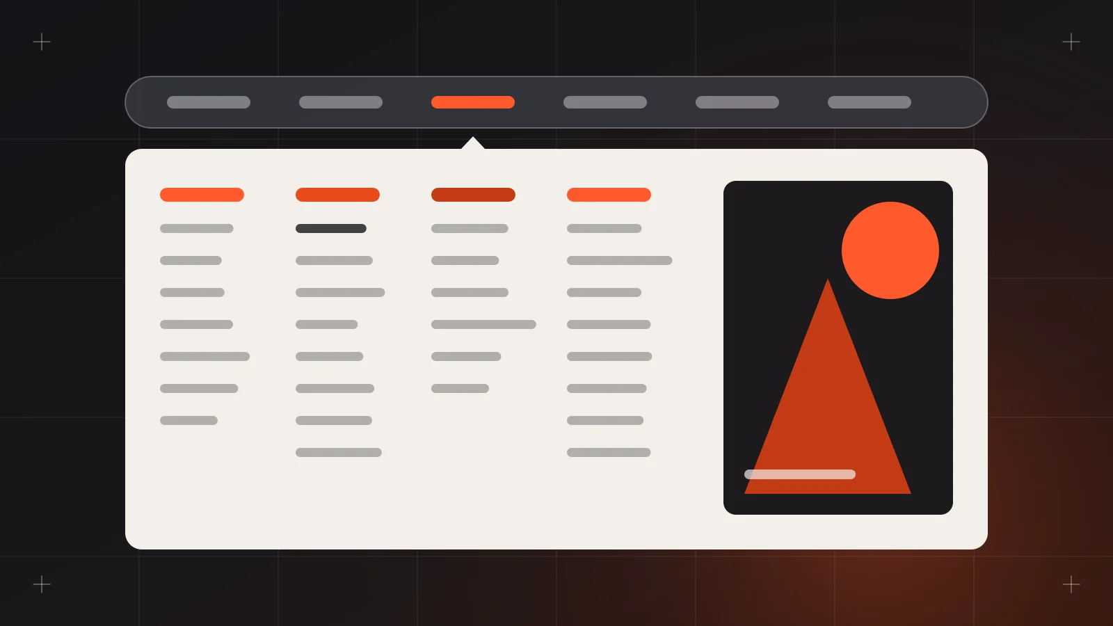
University websites are some of the hardest navigation problems I've worked on. A university is really dozens of organizations under one name: colleges, departments, graduate schools, admissions, research centers, student services and alumni offices. All of them want a spot in the top menu. I've designed websites for two universities, and in both cases the main question was the same: how does a 17-year-old on a phone find the program they want?
Context: what students actually come for
Nielsen Norman Group has studied university websites for years. Their University Websites report collects 152 design guidelines from testing with high school students, transfer students, master's applicants and parents in several countries (Nielsen Norman Group). One finding keeps coming up in discussions of that research: almost half of prospective students (48%) didn't realize a university offered the program they were looking for, even when it did (Elliance, citing NN/g).
That one hit home. The program is the product. If students can't find it, nothing else on the site matters.
The problem: an org chart disguised as a menu
When I started, the academic navigation followed the internal structure:
- Top level: colleges, named the way the university names them internally.
- Second level: departments.
- Third level, if you got that far: the actual degree programs.
This makes sense to staff. It doesn't make sense to a senior high student who knows they want "something with computers" and has no idea whether that lives under engineering, science or business. Some programs also sat in two places, which made people wonder whether they were different programs.
The existing dropdowns were long single columns that ran past the bottom of the screen. Hover menus opened and closed as the mouse moved across the bar. On mobile, it was a nested accordion three levels deep.
Students don't browse a university by its org chart. They browse by "what do I want to study, and can I get in?"
The design approach
Why a mega menu
A mega menu fits this problem. Nielsen Norman Group's guidance is that mega menus work well for large sites because users can "see rather than try to remember" their options, and the panel gives room for grouping and richer content (Nielsen Norman Group). The catch is that a badly organized mega menu is just a bigger mess. NN/g's own critique of poor mega menus points to unclear structure, decorative images instead of real choices, and an organizing principle users can't see (Nielsen Norman Group).
So the menu was the easy part. The structure underneath it was the real work.
Restructuring by how students think
I worked through grouping exercises with the university team, testing the groupings against the way students describe what they want to study, then grouped programs by field of study instead of by college. The academic panel became:
- Fields of study in plain words, like Business and Accountancy, Computing and IT, Health Sciences, Engineering, Education, and Arts and Communication.
- Level as a clear split: undergraduate, graduate and short courses.
- One prominent link to "View all programs", which opens the full program finder.
Colleges still exist, but they moved to their own "Colleges" item and to each program page. That kept the staff view without forcing it on students.
I also followed a few NN/g rules strictly:
- Each program appears once. No duplicates across groups.
- Labels start with the most useful word. "Nursing" rather than "Bachelor of Science in Nursing" in the menu, with the full degree name on the page.
- No decorative imagery. One small feature slot for admissions deadlines, because that's something students actually look for.
Getting the hover right
Small timing details make a mega menu feel calm instead of twitchy. NN/g recommends waiting about half a second before opening a hover menu and keeping it open briefly after the pointer leaves (Nielsen Norman Group). I wrote these timings into the dev handover with a note about diagonal mouse movement, so the panel doesn't snap shut when someone moves toward a link. Click and keyboard access also open the panel, so it's not hover-only.
Careful with audience menus
Universities love "For Students / For Parents / For Alumni" navigation. NN/g warns that audience-based navigation confuses people who fit several groups or aren't sure which one they belong to, and recommends it mainly as secondary navigation (Nielsen Norman Group). We kept audience links in a small utility bar at the top and kept the main menu task-based: Academics, Admissions, Campus Life, Research, About.
Mobile: the menu isn't enough
A mega menu doesn't translate to a phone. On mobile, I designed the Academics item to open a short list of fields, each leading to a filtered view of the program finder rather than another nested level.
The program finder did the heavy lifting. Following common program-finder best practices, it offered A–Z order, logical groupings and filters for field, level, college and format, plus keyword search (Elliance). Search was visible at the top, not hidden inside the menu.
Trade-offs
- Politics versus findability. Every college wanted top-level visibility. Grouping by field meant some colleges lost their spot in the main bar. Walking stakeholders through the site as a student, step by step, did more than any argument I could make.
- Completeness versus scannability. Listing every program in the panel was tempting but unreadable. We showed fields and top programs, and trusted "View all programs" for the rest.
- Content upkeep. A finder only works if program data stays accurate. We designed simple CMS fields so staff could update programs without touching the menu.
What came out of it
I can't share analytics, but the feedback from walkthroughs was clear. In walkthroughs, people new to the site found programs faster and with fewer wrong turns. The admissions team also stopped getting as many basic "do you offer this course?" inquiries.
What I'd do next
- Tree testing before visuals. I'd validate the field groupings with a proper tree test before any visual design.
- Search analytics. Feed site search terms back into labels. If students keep typing "IT", the label should probably say IT.
- Career-based entry points. Let students start from an outcome, like "I want to be a nurse", and land on the matching programs.
- Program comparison. A simple side-by-side of two or three programs, covering duration, requirements and fees, so students don't have to juggle browser tabs.
A mega menu is just the doorway. The real design is in the room behind it.
Sources
- Nielsen Norman Group, "University Websites" report: https://www.nngroup.com/reports/university/
- Nielsen Norman Group, "Mega Menus Work Well for Site Navigation": https://www.nngroup.com/articles/mega-menus-work-well/
- Nielsen Norman Group, "Mega-Menus Gone Wrong": https://www.nngroup.com/articles/mega-menus-gone-wrong/
- Nielsen Norman Group, "Audience-Based Navigation": https://www.nngroup.com/articles/audience-based-navigation/
- Elliance, "Academic Program Finders: Best Practices and Examples": https://aha.elliance.com/2024/06/27/academic-program-finders-best-practices-and-examples/