Craft
Why I sketch before I open Figma, and how a few minutes with a pen saves hours of polishing the wrong idea.
Draft: full write-up coming.
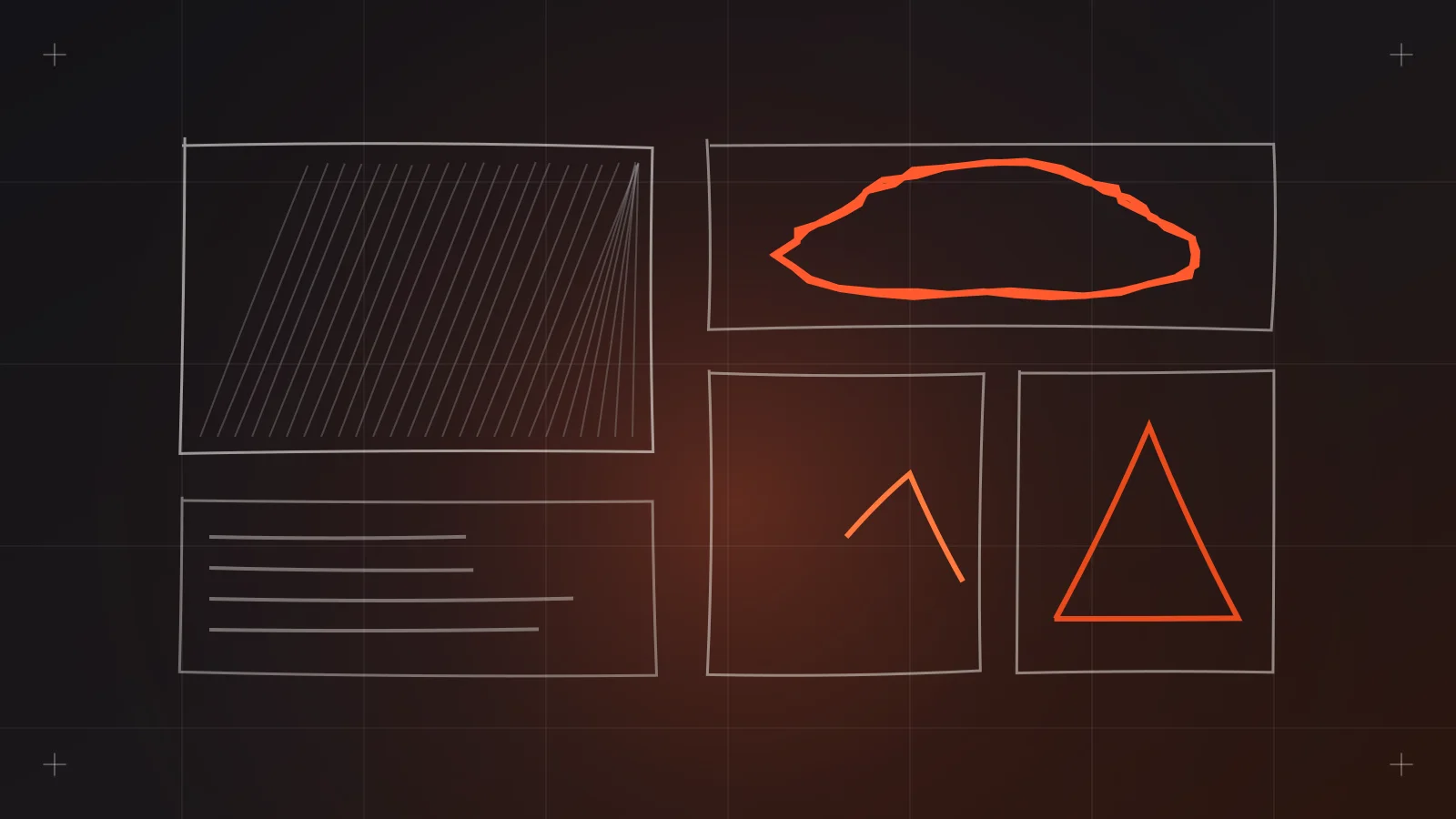
I spend most of my day in Figma, and I still start almost every project with a pen. Not because it looks nice in a process photo, but because it's the fastest way I know to find out which ideas are bad before I've invested in them.
This is the habit I push hardest when mentoring junior designers, and the one they resist the most at first.
The problem with starting in Figma
Figma is a commitment machine. The moment you draw a rectangle, you're picking a width, a radius, a color, a font. Those choices feel small, but they pull your attention toward polish instead of the question that actually matters at the start: is this the right idea?
Bill Buxton's book Sketching User Experiences makes this point well. He treats sketching and prototyping as points on a continuum. Sketches come during early exploration and are meant to suggest and question. Prototypes come later and are meant to refine and commit. The trouble is when you skip straight to the second.
Buxton also argues that a sketch's ambiguity is where its power comes from. A rough sketch leaves room for interpretation, which invites other ideas. A polished screen looks finished, so people react to the details instead of the concept.
A sketch asks "what if?" A high-fidelity mockup says "here it is." Early on, you want the question.
What the research says about making many
One study I come back to often is by Steven Dow and colleagues at Stanford, titled Parallel Prototyping Leads to Better Design Results, More Divergence, and Increased Self-Efficacy. Participants designed web banner ads. One group made several prototypes in parallel before getting feedback. The other group made one at a time, getting critique after each.
The parallel group's ads performed better on click-through and were rated higher by experts. Their designs were also judged as more diverse, and the participants reported a bigger gain in confidence.
The lesson I take from it: exploring several directions side by side beats perfecting one and iterating on it. And sketching is by far the cheapest way to make several directions.
How I sketch
My setup is simple: A4 paper or a sketchbook, a fine black pen and a thicker marker. No pencil, because erasing turns it into polishing again.
My usual process:
- Write the question at the top. "How does a driver confirm a delivery?" or "What does a student see after logging in?" One question per sheet keeps it focused.
- Crazy eights for breadth. Fold the paper into eight panels and sketch eight different ideas in eight minutes. Most will be bad. That's the point.
- Pick two or three. Circle the ideas worth exploring, and note what's good about each.
- Sketch the flow, not just the screen. Buxton notes that sketching interaction is harder than sketching a static object because it has to show time. So I draw a few screens in sequence with arrows, like a storyboard.
- Annotate. Short notes on what's happening and what's still a question.
Only after that do I open Figma, and usually it's for lo-fi wireframes, not UI.
Where it saves the most time
On agency projects, sketching earns its keep in a few specific places:
- Kickoff and discovery. Sketching during a workshop with the client and our system analysts helps everyone agree on what's being built before anyone argues about colors.
- Complex flows. Mobile apps with multiple user roles, like a trucking app with separate user and driver sides, or an exam review app with practice tests and progress tracking. The flow gets messy fast, and paper makes it visible.
- Odd interactions. An interactive mall map, a personality quiz for a drinks brand. Things with no standard pattern to copy.
- Layout exploration. Five homepage layouts on paper take minutes. Five in Figma take an afternoon.
Sketches are social
Buxton describes sketches as social things, meant to be shared and talked about. I agree. The best sketching sessions I've had are with developers and system analysts in the room, because they spot technical problems early and often suggest simpler solutions.
It also lowers the bar for everyone. A project manager who would never touch Figma will happily grab a pen and draw what they mean. That's often the moment a vague requirement becomes clear.
Common objections
"I can't draw." You don't need to. Boxes, lines, squiggles for text, a circle with an X for images. If someone can tell what the box is, it's good enough.
"It's faster in Figma." For one screen, maybe. For eight different ideas, no. And the ideas you'd explore in Figma tend to be variations of the first one you drew.
"Clients won't take it seriously." I rarely show raw sketches to clients unless we're sketching together in a workshop. They're a thinking tool for the team. What the client sees is the wireframe that came out of it.
"We have AI now." I use AI tools a lot, including Claude Skills I've built for lo-fi wireframing. They're great at producing options fast. But choosing between options still needs a clear question and your own judgment, and sketching is how I get both.
Tips if you're starting out
- Set a timer. Short limits stop you from polishing.
- Use a thick pen. You physically can't add too much detail.
- Keep every sheet. Old sketches are a surprisingly useful record of why an idea was dropped.
- Take a photo and drop it into the Figma or FigJam file so the thinking stays next to the design.
- Sketch the empty, error and loading states too. They're usually forgotten until QA.
Sources
- UXmatters, book review of Bill Buxton's Sketching User Experiences: https://www.uxmatters.com/mt/archives/2007/10/book-review-sketching-user-experiences.php
- Dow et al., "Parallel Prototyping Leads to Better Design Results, More Divergence, and Increased Self-Efficacy" (abstract): https://ideas.repec.org/h/spr/undchp/978-3-642-21643-5_8.html
- Nielsen Norman Group, "Pencils vs. Pixels for UI Prototyping and Sketching" (video): https://www.nngroup.com/videos/pencils-vs-pixels/