Craft
How I set up auto layout so frames resize themselves, and why it's the first thing I check when a file starts falling apart.
Draft: full write-up coming.
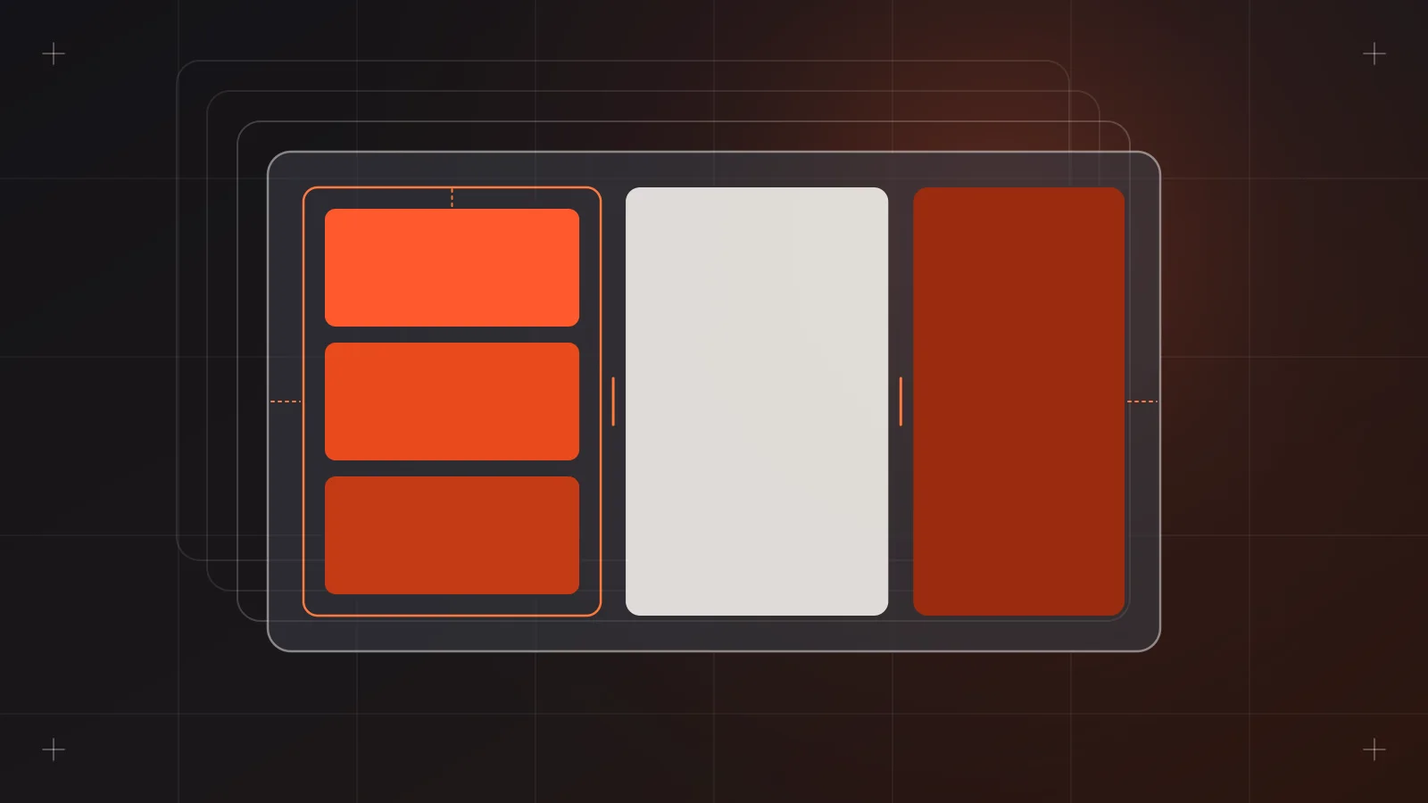
If you've ever changed one word in a button label and then spent ten minutes nudging every element around it, you already know why auto layout matters. It's the feature I lean on most in Figma, and it's the first thing I check when I open a file from someone else on the team.
Figma describes auto layout as the way to arrange objects inside a frame so their positions update as you add, remove or reorder them. That's accurate, but the way I think about it is simpler. Auto layout turns a drawing into a set of rules. Once the rules are right, the design keeps itself tidy.
Why it matters on agency work
Most of my projects are websites and apps for clients in very different industries: hotels, universities, banks, restaurant chains, a trucking company with separate user and driver apps. The content changes constantly. A hotel adds a new room type. A university renames a program and the title doubles in length. A bank's legal team rewrites a disclaimer the day before a review.
Without auto layout, every one of those changes is manual cleanup. With it, I edit the text and the card, the section and the page adjust. That's time I get back for actual design decisions.
There's a handoff reason too. Auto layout maps closely to how developers build layouts in CSS. Gap, padding, direction and alignment are concepts our front-end team already uses. When my frames behave like flexbox, the build matches the design more closely and there are fewer "why is this 13px here?" conversations.
The properties I actually use
As of 2026, an auto layout frame in Figma has three flows:
- Vertical: stacks children on the y-axis. Lists, feeds, form fields, page sections.
- Horizontal: places children on the x-axis. Button rows, nav bars, icon plus label pairs.
- Grid: columns and rows, with children that can span multiple cells. Galleries and bento-style layouts.
Horizontal and vertical flows can also wrap, which moves children to a new row or column when they run out of space. That's what I use for tag and chip groups.
Inside each flow, these are the controls that do most of the work:
- Gap: either a fixed number or Auto. Auto has three options, Between, Around and Evenly, which match CSS
space-between,space-aroundandspace-evenly. - Padding: uniform, per axis or per side.
- Resizing: each child can be Hug contents, Fill container or Fixed. Hug shrinks or grows around the content. Fill takes up whatever space the parent gives it.
- Min and max width/height: the underrated one. A card can fill its container but never stretch past a readable width, and a button can hug its label but never get narrower than a tap target.
- Ignore auto layout: what used to be called absolute position. The layer stays in the frame but leaves the flow, so I can pin a badge to a corner or float a close icon.
Smaller settings worth knowing: text baseline alignment (press B in the alignment box), whether strokes are included in layout, and canvas stacking order when children overlap.
How I build a component with it
I build from the inside out. Take a simple product card for a retail site:
- Text first. Title and price go in a vertical auto layout with a small gap. The title is set to fill width so long names wrap instead of pushing the card wider.
- The text block and an add-to-cart button go into another vertical frame with padding. That's the card body.
- The image and the body go into the outer card frame. Image set to fill width, fixed aspect.
- The card itself is set to fill container, with a min and max width.
Then I stress test it. I paste in the longest product name I can find, delete the price, swap the image for a tall one and drag the frame narrow and wide. If anything breaks, the rule is wrong, not the content.
If a layout only works with the placeholder text, it doesn't work.
Common mistakes I see (and made)
Wrapping everything in one giant frame. People select a whole screen and hit Shift+A. Figma will do it, but you get one flat stack that's hard to control. Nest small frames inside bigger ones, each with one job.
Mixing up hug and fill. If a parent hugs and its child fills, neither knows who sets the size. Decide which layer owns the width and work out from there.
Using spacer rectangles. An invisible 24px rectangle between two elements is a sign the gap or padding isn't set up. It also confuses developers reading the layer tree.
Hiding layers to "keep" space. In auto layout, hidden layers are removed from the flow. If you really need the space held, setting opacity to 0% keeps it, but most of the time the better fix is to rethink the gap.
Forgetting about strokes. If spacing looks slightly off in nested frames, check whether each frame includes or excludes strokes from layout. The setting is per frame.
Detaching instances to reorder things. You can't reorder children inside an instance. If you keep needing to, the main component needs a different structure, or a slot.
How it plays out with the team
As Assistant Creative Director, part of my job is reviewing files from junior designers before they go to a client or to dev. My auto layout checklist is short:
- Can I resize the frame and nothing overlaps?
- Is spacing coming from gap and padding, not from manual positioning?
- Do spacing values come from our spacing scale, ideally bound to variables?
- Are names on the frames meaningful (
card/body, notFrame 427)?
When I mentor someone, I don't explain every property up front. I give them a component that breaks when the content changes and ask them to fix it. Learning auto layout by repairing something sticks much better than reading a list of settings.
Where it connects to everything else
Auto layout is the base layer for the rest of my Figma craft. Components only work well when they're built on solid auto layout. Variables only pay off when gap and padding are actually bound to spacing tokens. And prototypes feel more real when frames reflow as content changes.
If I could only teach one Figma feature to someone new on the team, it would be this one.
Sources
- Figma Learn, "Guide to auto layout": https://help.figma.com/hc/articles/31289464393751
- Figma Learn, "Explore auto layout properties": https://help.figma.com/hc/en-us/articles/360040451373
- Figma Best Practices, "Components, styles, and shared libraries": https://www.figma.com/best-practices/components-styles-and-shared-libraries/