Work
Designing price displays that change with promos, member rates and demand, without making shoppers feel tricked.
Draft: full write-up coming.
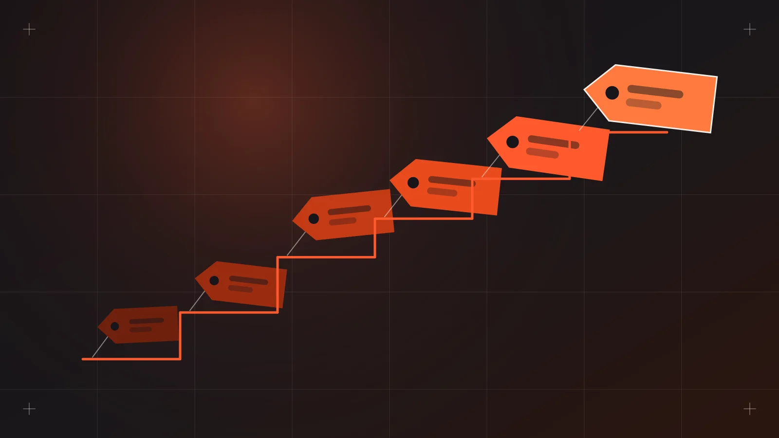
The prices online rarely stay still. There's the regular price, the payday sale, the member rate, the bundle deal, the voucher that stacks (or doesn't), and the flash sale that ends at midnight. For hotels, the price of the same room can change from one night to the next. I've designed for this kind of moving price across retail and hospitality projects, and I've learned that the hard part isn't the pricing logic. It's helping a shopper trust the number they see.
Context: why prices move
Dynamic pricing is a broad term. In the projects I've worked on, it usually means one or more of these:
- Promotional pricing: scheduled sales, flash deals and seasonal markdowns.
- Segment pricing: member, loyalty or app-only prices.
- Bundle and tiered pricing: buy more, pay less per item.
- Demand-based pricing: rates that rise and fall with dates and availability, common in hotels.
Each one is reasonable on its own. The trouble comes when they pile up on one product page and the shopper has to work out what they'll actually pay.
The problem: moving prices erode trust
Research on this is fairly consistent. People don't hate price changes. They hate price changes that feel hidden, unpredictable or unfair.
The UK consumer group Which? ran focus groups on dynamic pricing and found that people judge fairness by transparency, predictability, choice and whether the higher price brings them any benefit. Price increases after someone had already been quoted a price felt especially unfair. One participant summed up the limits of disclosure: "you're telling me that I'm being ripped off but I'm still being ripped off" (Which?).
A 2025 Dectech survey of 1,166 people found that framing changes how fair a price feels. A higher peak price presented as a discount from the normal price rated as fairer than the same gap presented as a peak-time penalty. Unexpected fluctuations also did far more damage than expected ones (Dectech).
Then there's the display itself. Baymard found that 18% of desktop sites and 11% of mobile sites make the product price unnecessarily hard to find, and 14% of desktop sites place promotions far from the price (Baymard Institute). On the checkout side, 12% of shoppers who abandon a cart say they couldn't see or calculate the total cost up front (Baymard Institute).
In the Philippines there's a legal angle too. The Internet Transactions Act of 2023 requires online merchants to indicate the prices of what they sell, and e-retailers to show business details like name, address and contact info (Forvis Mazars). Clear pricing isn't only good UX. It's part of compliance.
A price that changes is fine. A price that surprises is what loses the sale.
The design approach
My goal on these projects was one honest number, with the reasons behind it visible but never in the way.
One price, clearly the price
The final price the shopper pays is the biggest, boldest number in the buy area. If there's a discount, the original sits next to it with a strikethrough in a muted color. I follow Baymard's advice to show the saving in a clear way, and when space is tight, I pick whichever is bigger: the percentage or the peso amount.
Every offer lives next to the price
Promos scattered across banners, badges and descriptions make shoppers wonder whether they stack. I group all offers into one block directly under the price:
- What the offer is, in plain words ("₱200 off with code" or "Members save 10%").
- Whether it's already applied to the price shown.
- When it ends, if it ends.
Each offer appears once. If a long page needs a reminder, it uses the same wording, so it doesn't read like a second deal.
Explain without lecturing
For hotel rates, I design small, calm explanations near the date picker, such as showing that weekend nights cost more and weekday nights cost less. Following the Dectech finding, I frame lower rates as savings ("Save on weekday stays") rather than framing higher rates as surcharges.
A price calendar works well here. Shoppers can see the pattern themselves and choose the dates that fit their budget, which gives them the sense of choice the Which? research highlights.
Lock the price once it's quoted
This is the rule I push hardest with clients. Once a shopper has a price in their cart or booking form, it holds for a reasonable window. If it has to change, the interface says so clearly before payment, never silently at the last step.
Urgency, but only if it's true
Countdown timers and "only 2 left" badges work because they create pressure. I'll design them only when they reflect real data. A fake timer that resets on refresh is the fastest way to lose trust, and it's the kind of thing shoppers screenshot and share.
Trade-offs
- Clarity versus marketing. Marketing teams want every promo shouted everywhere. Grouping offers into one block felt quieter to them at first. I showed them side-by-side mockups, and the cleaner version usually won on clarity.
- Price lock versus revenue. Holding a quoted price can mean selling a little below the latest rate. I frame it as a trust cost the business chooses to pay.
- Calendar versus simplicity. A price calendar adds interface weight on mobile. I made it collapsible, with a simple "cheapest nights" hint visible by default.
What came out of it
I can't share client figures, but the qualitative change was noticeable. Support teams fielded fewer questions about whether a voucher applied, and in review sessions stakeholders could explain the price on a page in one sentence. For me, that's the real test: if the people running the store can't explain the number, the shopper won't trust it.
What I'd do next
- Build a price component into the design system. One component that handles regular, sale, member and range prices, with documented rules, so every new page starts honest.
- Test the copy. Run quick preference tests on how discounts and rate changes are worded, in English and Taglish.
- Show price history. For big-ticket items, a simple "lowest price in 30 days" note would make discounts easier to believe.
- Write a pricing UX checklist for clients, covering the Internet Transactions Act basics alongside display rules.
Prices can move as much as the business needs. The interface's job is to make every move easy to see and easy to understand.
Sources
- Which?, "By fair means or foul? Consumer views on dynamic pricing": https://www.which.co.uk/policy-and-insight/article/by-fair-means-or-foul-aMgOA8Q0aQlZ
- Dectech, "Dynamic Pricing: How Do Consumers Respond to Fluctuations in Price?": https://www.dectech.co.uk/?p=8995
- Baymard Institute, "4 Pitfalls for Displaying Price Discounts on Product Pages": https://baymard.com/blog/product-page-price-discounts
- Baymard Institute, "Cart Abandonment Rate Statistics": https://baymard.com/lists/cart-abandonment-rate
- Forvis Mazars Philippines, "Internet Transactions Act of 2023": https://www.forvismazars.com/ph/en/insights/corporate-secretarial-alerts/internet-transactions-act-of-2023